Poster for Advertising the Event

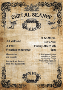
Upon confirming the venue location and date of the event, I could begin advertising the event itself. The focus of this advertising campaign was a poster with all the information about the event on it. It would be posted online, in order to attract guests to the exhibition. for this poster, I commissioned a student with a focus on Design to design the poster. Due to their Design focus, they would be able to create a poster more effectively than myself, making it stand out more, and reach a wider audience.Originally, I wanted the design to be black with white text, in order to invoke a ghostly vibe. However, upon consulting with the Designer, they advised a more historical look to focus on the Victorian-esche design that will feature throughout the scenery. Here is the final poster:

Screen Shot 2017-03-28 at 23.50.18

This poster shall be shared online, and posted up around the university in order to attract potential guests to the event.


Location for Exhibition

When planning my event, location was key. Finding a spot to host the exhibition allows it to be seen by the intended audience in order to gain feedback on the project, as well as theme the footage to the end location.

The first location I considered was the usher gallery/collection. This setting would suit the Victorian aesthetic of my content and its themes. However, use the location would cost a large fee that I do not have. If this event was to be hosted again in the future, a location that fits with the context, and can allow for the exhibition to stay open for a number of days will be used. However, as it stands at the moment, I do not possess the funds to commit to such a location, so an alternative will have to be used.

The location I am using for the exhibition is an empty shop unit in the St. Marks shopping area. Although this location does not have the aesthetic of the theme, set dressing will be used to make it fit the theme. The location has the practical equipment needed in order for the event to be properly hosted. The venue has enough space to for fill all the needs of the exhibition, having enough space for all the projections and equipment, whilst keeping them at the necessary size to make them effective; whilst having the space to host the guests themselves.

Ghost Map of Lincoln

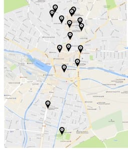
One element if the exhibition will be a map of Lincoln. On this map, location of reported hauntings will be marked. The map will then be projected onto a wall for the attendees to see. I will research the recorded hauntings present on the map, and will be able to discuss them with the audiences, adding another interactive element to the exhibition.

All of the locations on the map will be true reported ghost sightings, expected for the location where the event is taking place, which will also be featured on the map. Although not really haunted, talking to the audience about sightings and paranormal activity in the location will add to creating the haunted atmosphere, as they will believe they are in a haunted location. This setting will also connect the events that occur over the course of the exhibition to being because the location is actually haunted.

The markers on the map will be pinpoints, in order to directly and clearly point to each location. These will be black and white, to invoke a horror aesthetic. The main body will be black, to stand out on a light coloured map. They will then feature ghost faces, in order to show that they represent haunting locations, and not just places on a map.

The map itself will be the Google Maps map of Lincoln. To find these haunted locations, information will be gathered from online resources, such as the paranormal database used when writing the ghost stories for the exhibition. Details of each haunting, as well as there location, are required, in order for me to tell the guests about each of Lincoln’s hauntings. Locations with multiple hauntings will only be marked by one point, and expanded upon in the explanation, in order to not clutter the map with incoherent markers.

From research, it is clear why the ghost walk takes place in the city’s Cathedral quarter, as this is where most of the hauntings are recorded; possibly due to this being the oldest part of the city. Instead of focusing on this area, I expanded the map to feature a large part of the city, to show how far Lincoln’s hauntings starched out throughout the city, as well as allowing me to show the location where the event is taking place.

lincoln mao

Audio Testing

Although the main event of Digital Seance will be the conversation between myself and the Ghost, other elements will be present in the exhibition. One of the elements that will feature is the telling of ghost stories from the local area, told by the people how encountered and interacted with these spirits.

To find these stories, I looked through multiple websites documenting different encounters people have had with the supernatural. One key website for this was http://www.paranormaldatabase.com/hotspots/lincoln.php as it not only detailed stories, but there location as well. Another key source was the Lincoln Ghost Walk, as the stories used in this tour are from the local area.

From these accounts, I selected 4 different stories to feature in this section. By taking the key events recorded, I expanded them and put them into a script to be performed by an actor. The scripts were written as if they were a first hand account of the sightings, instead of someone telling the story they had heard from someone else. This adds more context to the story, connecting it to the person who encountered the spirits, instead of a random person retelling the stories. One of these scripts is as follows:

    ‘On this very night many years ago, during the rain of her majesty, Queen Victoria, me and a friend of mine had a plan to rob Edward King’s house when the Bishop was out one night. So, we managed to lure the Bishop away from the house for the night. Perfect time to break in and take what we need to make some money. Great plan, what could go wrong? Well, we waited nearby for the Bishop to leave, so we knew we could get in there. But as he was leaving, this huge figure was walking just behind him, and I’m talking huge. He was not the kind of guy you would want to cross, and if we got caught, that’d be the end. So we did not commit the crime. Years later, I went to confess my many sins to the Bishop, including the plan to rob the house. When I told him the tale, the Bishop looked confused. He told me he remembered that night, and he remembered that he was travelling alone.’

The original recording of this audio can be found here: https://soundcloud.com/user-326345295/rob-ghost-speech-og

However, only having the stories read out did not add to the haunted atmosphere I wanted to create for the event. To make the speeches sound more ghostly, I added some reversed reverb to the originals. This technique involves reverse the original speech and adding a large amount of reverb. Only this reverb is recorded, then un-reversed to go back to the original. Once this is added back to the original, its creates an effect that makes the actor sound as if they are talking as a ghost. Although the characters in the stories aren’t ghost, but those who have encountered them, this effects helps create the haunted atmosphere for the event. The first of these speeches can be heard here: https://soundcloud.com/user-326345295/rob-ghost-speech-1

Once completed, these speeches were cut together, with a haunting piano rift placed in between them. This audio would loop throughout the event, to help create the atmosphere for the exhibition, as it works with the mies-en-scene to create the environment. This completed audio can be heard here: https://www.youtube.com/watch?v=LwflAkgZfSQ&list=PLMSfG-YCfI69UpyUhHcA5HkDTYpIT13qC&index=15
Ghost Wall Walk Tests

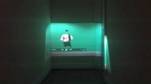
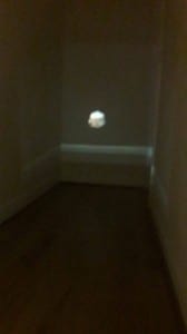
In order to make my character appear as if from no where, as a ghost would, I want to start the piece by having the character walk out of a wall; and end with them walking back into it. When projected onto a wall, it will look like the Ghost is emerging from, and returning into, the wall rather than just appearing. To create this effect, a mask is used which grows/shrinks in order to make the person appear/disappear into the wall. Behind this is a clean slate of the wall to make them truly disappear. The first test shots can be seen here:


From this first experiment, I was able to determine that the desired effect could be created. However, these test also revealed some issues that would need to be overcome. The first of these issues was getting enough space between the projector and the surface to make the person appear at the correct size. This distance would effect the possible brightness of the video, but if it is too small, then the ghost will not look like a real person.

17431635_10208923752439685_79612507_o


The second issue was that the background the ghost appeared from was too obvious, and broke the illusion. However, as these tests were shot on a green scree, I keyed out and removed the background, as this had proven to be a successful method from previous testing. The results of these second tests can be found here:


These were then projected onto the same wall to see if this looked more believable. The now black background was better than the green, and was much more believable. However, there is still some evidence that it is not the same location. Whilst this is passable, it is not fully ideal. Difference can be seen where the video is projected in a location different to the recordings source. In order to test the different this caused, I returned the video’s recording location, and projected the video there.

17373225_10208923752519687_438262519_o


17379864_10208923751479661_1254852751_o


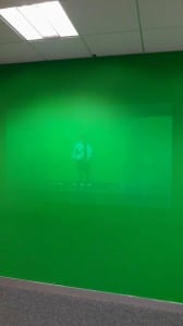
Projecting the green background into the green wall looked better than the other wall, however, this effect was still not ideal. Due to the bright lighting, the image was hard to see and would not work in a exhibition context. When the green was projected onto this wall in the dark, the green did not blend due to the difference in lighting between the wall and the video.

From these tests, I have concluded that a keyed-out background is the most optimal to be projected, as this blends in best with the surrounds. The projection is easier to see in the dark, and a black setting to match that is needed for the videos. Matching the footage to the surroundings it shall be projected in is the key part of making the video seem believable as a ghost in the room. Testing will be important to ensure that the video is displayed in the best way possible The wall walk technique itself creates the desired effect, and will be fine-tuned ahead of the exhibition.